
tl;dr People mostly like the star difficulty rating system, so we’re keeping it.
You might have noticed that we’ve been experimenting with adding difficulty rating to puzzles. I brought this notion to Puzzled Pint HQ last year because some teams in Austin kept asking which puzzles were the “easy” ones. Looking further into this, it became apparent that those teams were generally of mixed experience levels, and wanted to give the easier ones to the more novice solvers to attempt first.
Our First Two Trials
We tested this in Austin as an A/B test adding “Easy, Medium, or Hard” to the top of each puzzle in October. I asked each team after the event if they liked having the rating system. Obviously, the teams that normally asked about difficulty liked it, but nearly all teams gave really positive feedback among them. In fact, we had only a single negative comment of the nature “I was proud of myself, until I saw it was marked easy“.
In November and December, we went broader adding the same system to every city’s copies. This went over less well with several complains by GC of people hating the system, and in December of the rating being inaccurate. The ratings were based strictly on the “difficulty” response provided by playtesters on their feedback forms, but there was some judgement in determining the cutoff values between easy and medium and hard.
This negative feedback from GC was concerning and confusing, since the Austin test had gone so well. We didn’t know if only the players that hated it were complaining and GC wasn’t getting the positive feedback, or if the testing in Austin was an outlier and the hate was universal.
Another Test
Because of that negative feedback, we decided to scrap the ratings system for January 2017 and think about a resolution. It seemed the “I felt bad because this was supposed to be easy” was a common complaint on the feedback thread, so we decided on a slightly different system of using a 5-star rating instead of the English words. Hopefully, this would convey the information, but allow people to rate their abilities themselves instead of having the implicit judgement of not being able to get an ‘easy’ puzzle.
Thus, February’s puzzles had this new system, but, by golly, we were going to solicit player feedback this time to make sure. If you love charts like I do, you’ll like this next bit…
We had 434 teams do February’s set (1440 people, not including Game Control members). The puzzles’ difficulties ranged from 2 to 4 stars, as is our goal, not too easy and not too hard. Of course, in the future, it’s possible for various reasons that a puzzle set might legitimately contain a 1 or a 5-star puzzle.
February’s set was the most playtested, perhaps ever, in Puzzled Pint history. This ensures that the feedback on the system wasn’t tainted by incorrect difficulty ratings. Even so, I made the call to bump the Cupid puzzle to 4 stars because it had a large standard deviation instead of keeping it at the strict mean, which would have been 3 stars. We probably will formalize that going forward at setting star difficulties at the first standard deviation to the right of the mean.
So, how were the responses?
Well, first off, we didn’t have the response rate I’d hoped. Even if you don’t consider teams that didn’t finish the puzzle set (i.e. had fewer than 5 completed puzzles), here’s the response rate by city: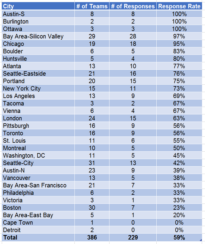
Still, a 59% response rate is enough to represent a good section of our players, and the results are likely skewed away from beginners anyhow because beginners are less likely to finish the set and thus have not given a response. Recall, Puzzled Pint is very much targeting the experience of the beginner puzzler, not the experts or even the ‘regulars’.
So, what were the survey results?
Only 4 teams in our survey reported that the difficulty ratings were harmful. Amazing! We figured that would be higher considering the feedback on the GC thread.
90 teams did say that they were not helpful, but that they didn’t mind their existence.
67 teams said that they were helpful, but not necessary.
Finally, 63 teams said that they really wanted us to keep them!
Breaking Down the Data
Those stats alone don’t tell the full story. Yes, more people wanted us to keep them than thought they were helpful, but we are interested to know how much they helped the more novice teams.
How are we to judge which QotM responses came in from the beginners vs the more experienced? We hypothesized that, since we collect solve times, we could look at those and assume that teams that took longer to finish the set were the less experienced puzzlers.
But wait! What about team size? Don’t smaller teams take longer? To check, I ran those numbers and came up with this lovely chart:
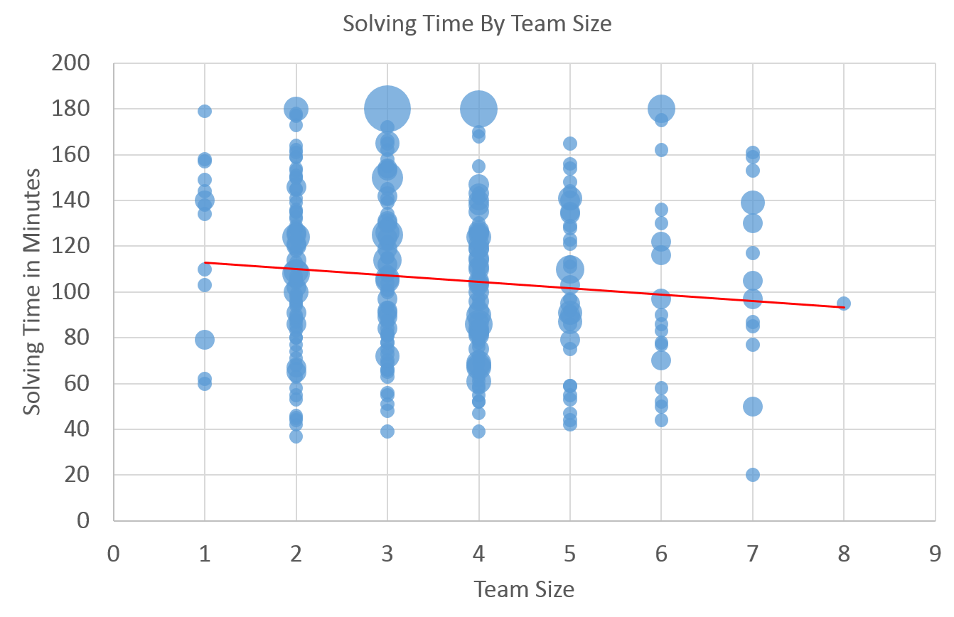
Nope! Team size matters very very little to overall solve time. There is a clear downward trend, but the standard deviation is nearly a consistent 40 minutes for each sized team.
In the chart, I used larger bubbles when multiple teams had the same exact size and minutes taken. As you can see by the data points, there was a huge variance of solve times, no matter the team size.
Therefore, I felt safe in doing the analysis based purely on the number of minutes taken to do the set, assuming those that took longer were the more inexperienced. A simple histogram sorting those times into buckets of 15 minutes allowed me to create this graph of the opinion results:
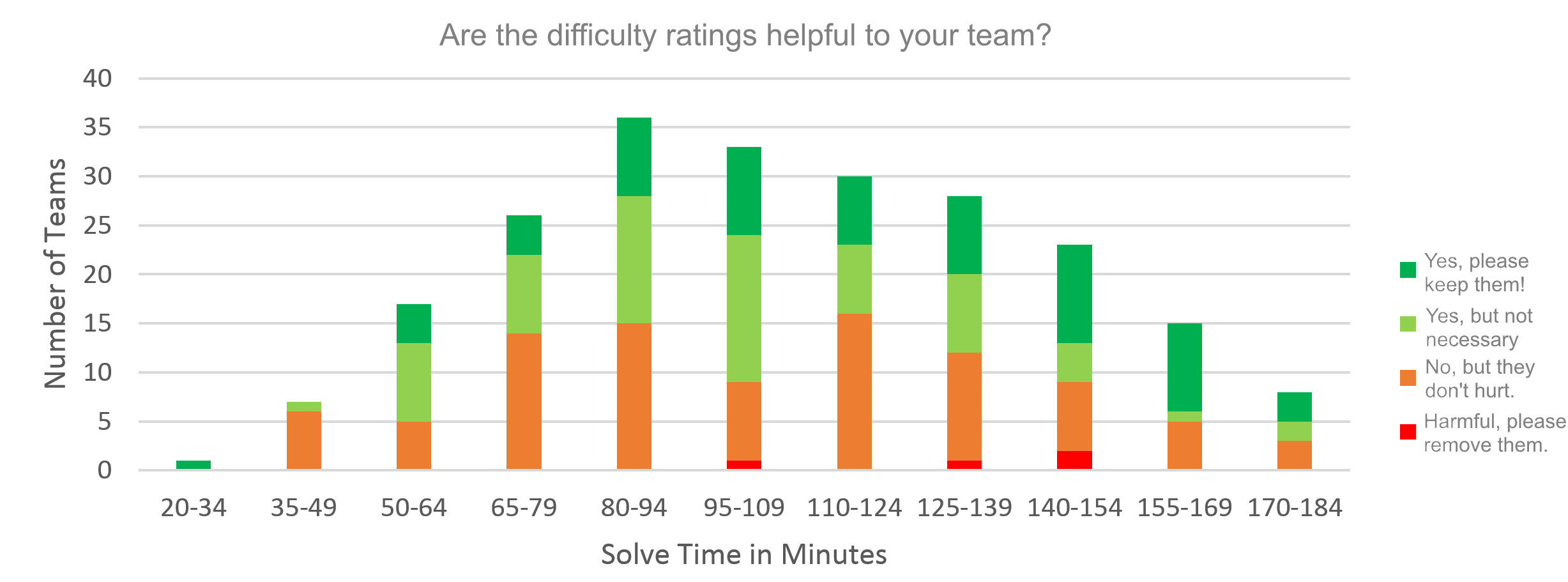
First of all, let us revel in the lovely emergence of the Gaussian curve again in nature. This one has a fatter tail than true normal, but it’s nice and smooth. Ahh.
Next, we can clearly ignore the red bars, the ‘complainers’, as they are so few. So, let’s look only at the rest.
Both light green and orange show no clear trend, but it does seem the dark green increases as solving time increases. For a clearer picture let’s ignore the number of teams in each category and look at the percentages within each:
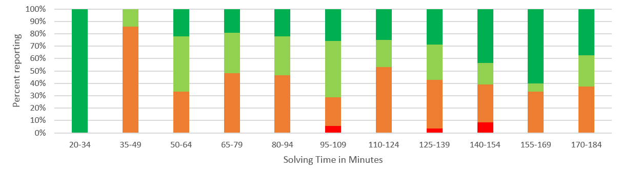
Now we can see a significant trend. Ignoring the outliers on either end (there’s only one team in the 20-34 bucket). Even though a pretty constant percent of the teams think the rating aren’t helpful, the longer a team takes to solve the more they like the rating system!
Okay, so there’s one lingering question that remained in my mind. Is this city dependent? Maybe some cities just hate them and others like them? Will we see a significant variance among cities, or will they all just be average? Well, check this out:
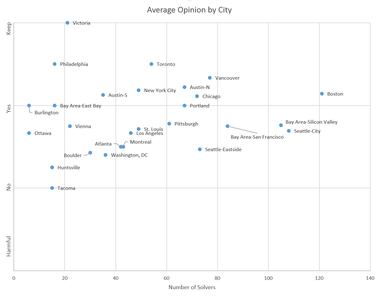
Boom! We have a triangle! I’ve put the size of each city on the X axis, and their average rating on the Y. As cities grow the responses move towards the mean answer of ‘slightly yes’. Still, I’m amazed at the variance in the smaller cities (this is actually locations, not cities, but you know what I mean).
Boston, our largest city by far is clearly supportive of the rating system, not like Victoria’s 100% support, of course, but solidly above the disdain that Tacoma’s 17 people have. Luckily, this chart shows that, by combining cities, I wasn’t significantly masking any strong negatives from only a few. No city really minds the system (on average), and most of them are well into the ‘yes’ range. Austin (both sites) are well into the yes range, which validates the earlier testing there.
Overall folks, the rating system is here to stay. Thanks for participating, and please keep the suggestions and feedback coming, so we can continue to improve in the future.
Yours Truly,
Neal Tibrewala
Puzzled Pint HQ
I give this post ★★★★★.