
We do our best at Puzzled Pint events to take attendance. It started in Portland as a curiosity. Or maybe an obsession on the part of Matt C. We just knew we weren’t going to break 30-40 people in attendance, so tracking seasonal change in participation was a fun curiosity.
Fast-forward to moving Puzzled Pint beyond Portland. More cities, more attendees, even breaking some cities into multiple regions (Portland, Seattle, London). When Portland started routinely getting 80+ people, shopping for bars to host the event became much more constrained. As we pull in more guest authors, they want better data on how many people their puzzles will reach. The curiosity became a necessity.
We collect the attendance data, but don’t often share it in an interesting way. The raw data is always available by digging through the standings page for each city, but I thought it would be fun to share graphically. The underlying data covers a year and 3 months. That starts after the explosive growth in Portland and Seattle, but early enough to capture the birth of a dozen new cities.
Below, we have global attendance — the sum of all the cities. This charts overall growth, such as onboarding new cities, as well as growth within the cities.
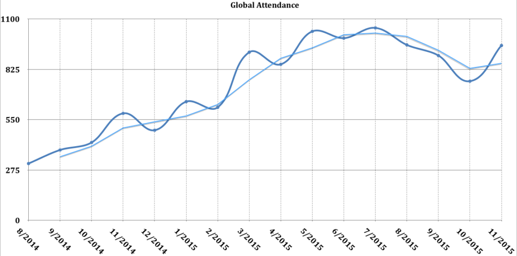
The dark blue squiggily line shows actual attendance, smoothed to curves. The offset light-blue line shows a 2-month rolling average. This average gives a more realistic estimation that buffers over sudden spikes or dips. You can see the trend globally that we always see in Portland: a bump in the summer and a dip in the winter. When it gets cold, people are less likely to leave the warmth of their homes.
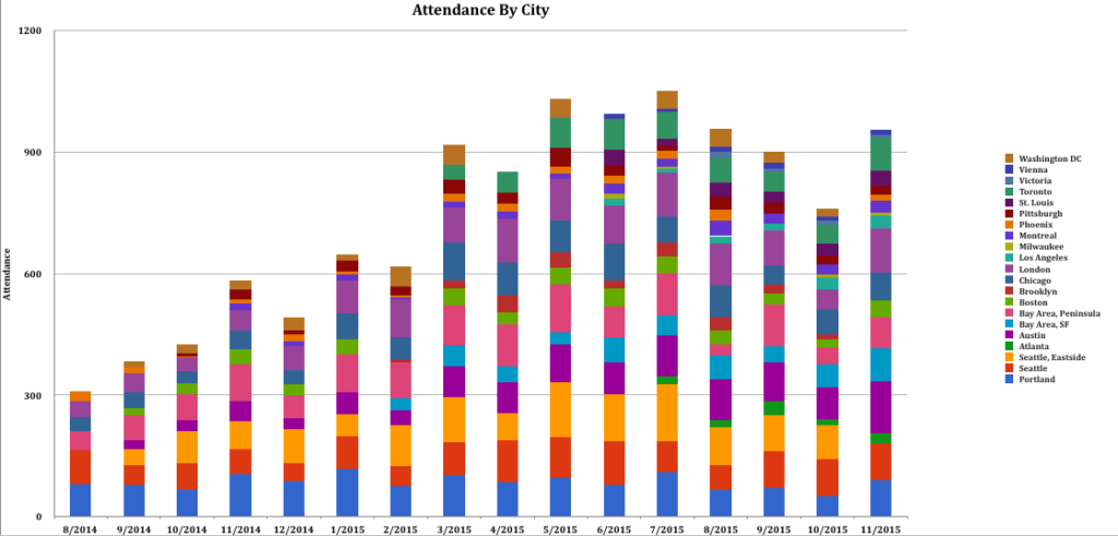
Just for fun, I made a stacked-bar chart, broken down by city. The colors and smaller slivers are pretty difficult to read, but you can get a feel for which cities pull in the larger numbers of people. (Spoiler alert: it’s larger urban centers and/or Puzzled Pint venues that have been around longest. Shocking, I know.)
I’d considered putting the same data on a line chart, comparing city to city. I felt that was perhaps a little too disheartening to have larger cities directly compared to smaller ones in such a fashion. I instead plotted each city individually, using the same range for the x (time) axis, but varying the y (attendance) range to better normalize and fit the data for a given city.
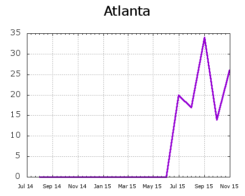
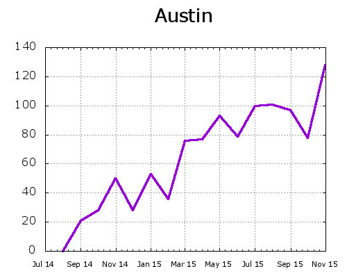
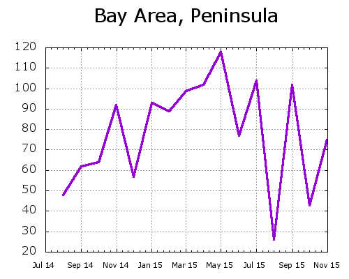
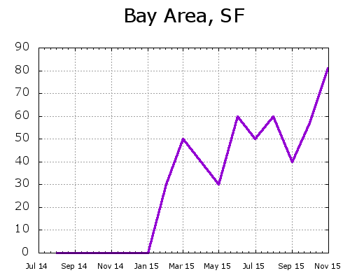
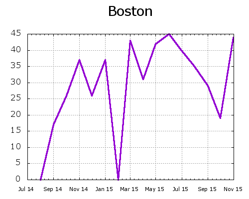
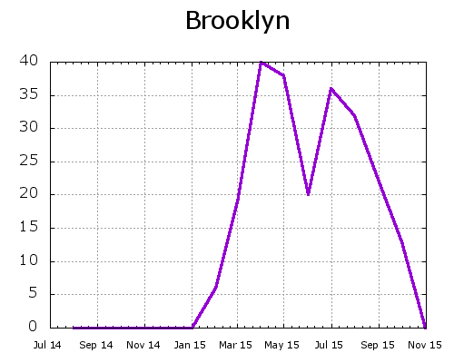
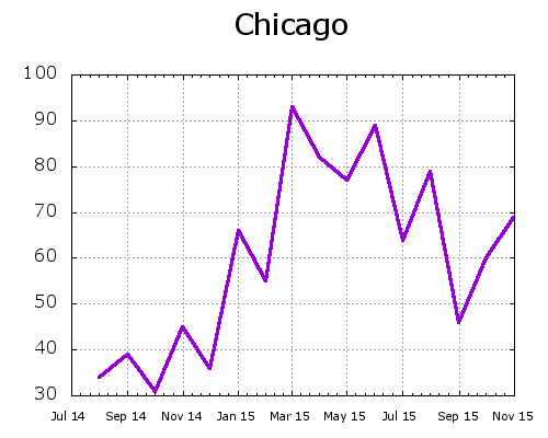
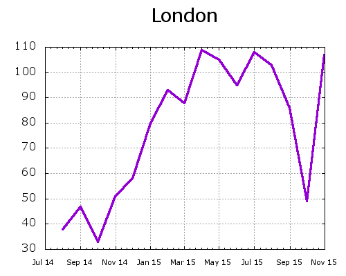
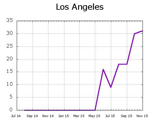
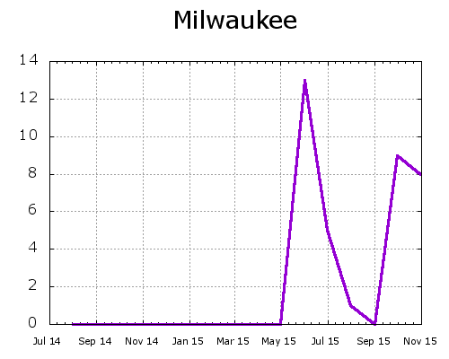
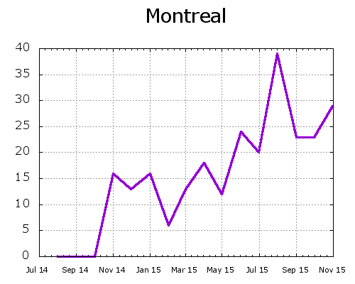
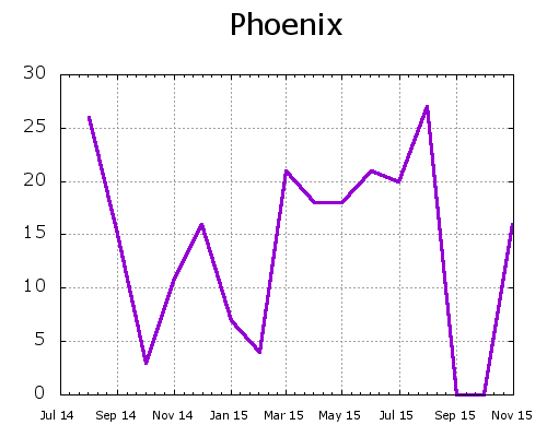
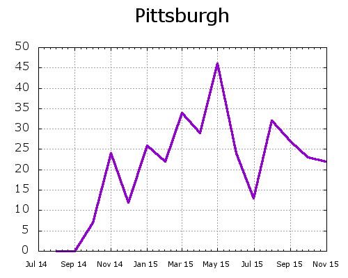
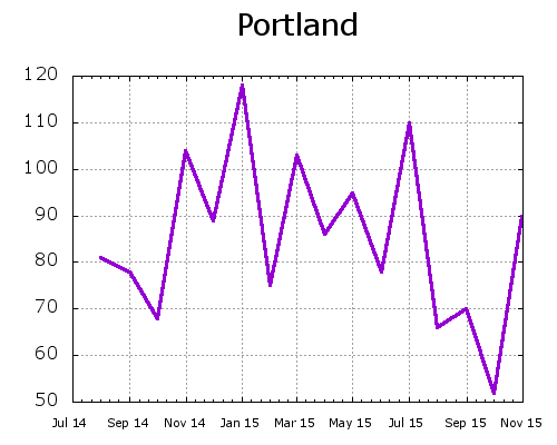
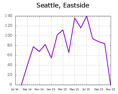
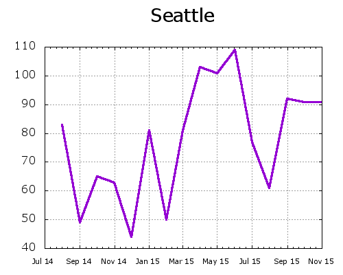
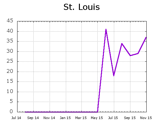
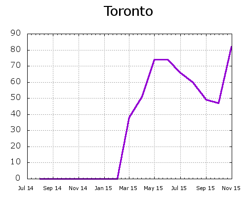
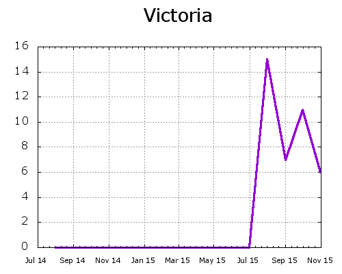
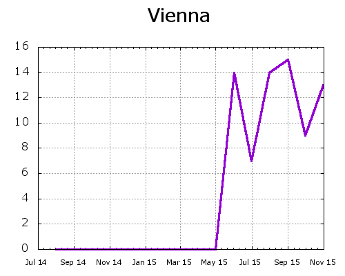
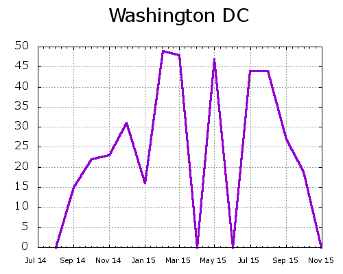
Keep in mind that there will be some fluctuation and bounce when looking at individual cities. Sometimes a city isn’t able to report attendance stats (or even overall standings) for the month. Sometimes there are teams that take packets but quietly leave without checking in with GC. Sometimes additional teammembers arrive part-way through the event without being counted. Looking at the global numbers helps buffer away some of these localized glitches. Looking at an individual city, especially a smaller one, may result in what appears to be wild changes in attendance due to the more significant margin of error.
So: what does it all mean? It means Puzzled Pint continues to grow. If you’d like to run Puzzled Pint in your city, please contact us and we’ll walk you through what it takes. (Hint: it’s pretty easy!)
I started doing Puzzled Pint in May of 2011 and have attended around 30 times since then. I was instantly hooked by the laid back atmosphere, the friendly and helpful members of GC, and of course the challenging but fun puzzles. I’ve been amazed to watch Puzzled Pint spread across the US and then the world over the years. I’m proud of the Portland team for keeping this event going for so long, and thankful of all of the volunteers worldwide who donate their time and money to bring us such a great collection of puzzles every month. Maybe in another five years every country will have their own Puzzled Pint gathering!
Thanks for all of the fun,
James of [4 – x] + y